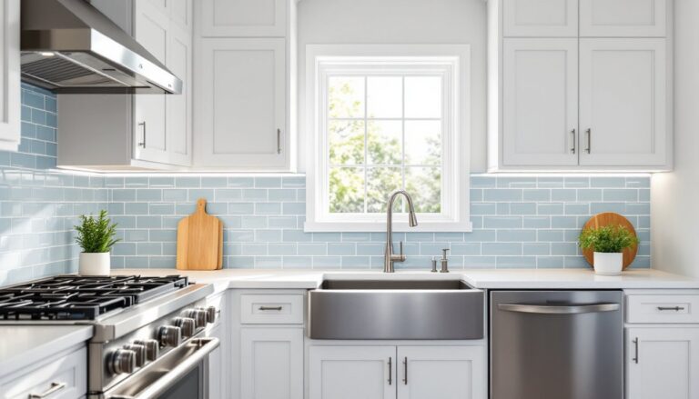
A blue backsplash can shift a kitchen from dated to dramatic in a single weekend. Whether the goal is coastal calm or bold statement-making contrast, blue tile offers versatility across styles, from farmhouse to modern. It pairs well with white cabinetry, stainless appliances, and natural wood tones, making it a practical choice for renovations that need to work with existing finishes. This guide covers classic subway layouts, deep navy options, patterned mosaics, and how to match blue tones to cabinet colors, countertop materials, and lighting conditions without guesswork.
Table of Contents
ToggleKey Takeaways
- A blue backsplash kitchen design transforms spaces from dated to dramatic while offering versatility across multiple design styles—from farmhouse to modern—without requiring a full remodel.
- Blue tile hides water spots better than white and recedes visually in small kitchens, making it both practical and aesthetically valuable near sinks and stovetops.
- Navy and lighter blue tones have proven staying power in home design, offering better resale value than trendy metallics or high-contrast colors that may quickly date.
- Classic 3×6-inch subway tile in running bond patterns with light gray grout provides a clean, timeless look, while larger formats and herringbone patterns add contemporary flair for accent zones.
- Match blue backsplash tones to cabinet colors and natural light direction: pair white/cream cabinets with any blue shade, use blue-gray for gray cabinetry, and opt for deeper blues in north-facing kitchens where cool light can wash out lighter tones.
- Dark navy and cobalt backsplashes require weekly degreasing maintenance but deliver dramatic anchoring power when paired with glossy glazes and warm hardware to avoid a cold, industrial aesthetic.
Why Choose a Blue Backsplash for Your Kitchen?
Blue sits in the cool spectrum, which means it recedes visually, helpful in small kitchens where warm tones can feel heavy. It also hides water spots better than white tile, a bonus near sinks and stovetops.
Unlike trendy metallics or high-contrast blacks, blue has staying power. Navy has been code-approved in kitchens for decades, and lighter blues echo classic Delftware and French country tile. This makes resale safer than, say, a millennial pink or chartreuse backsplash.
Blue works across multiple design styles without requiring a full remodel. Pair it with brass fixtures for warmth, matte black hardware for contrast, or brushed nickel for a neutral bridge. It also plays well with both cool-toned quartz and warm butcher block countertops, giving flexibility if countertops aren’t part of the current project scope.
From a material standpoint, glazed ceramic and porcelain tiles in blue are widely available in standard sizes (3×6-inch subway, 4×4-inch field tile, and 12×12-inch format), which keeps costs predictable and installation straightforward for DIYers.
Classic Blue Subway Tile Backsplash Designs
3×6-inch subway tile in a running bond (brick) pattern remains the workhorse layout for backsplashes. Actual tile dimensions are typically 3×6 inches, and a standard box covers about 6 square feet. Budget 10% extra for cuts and breakage.
For a classic look, install subway tile in a horizontal running bond with 1/8-inch grout lines. Use a light blue glaze, something in the robin’s egg or powder blue range, with white or light gray grout. This combination reads clean without the sterile feel of all-white tile.
A vertical stack bond (tiles aligned in columns) modernizes the subway format. This works especially well with longer 4×12-inch or 3×12-inch planks in a soft blue-gray. The vertical lines draw the eye up, helpful in kitchens with 8-foot ceilings.
Herringbone and chevron patterns add movement but require more cuts and careful layout. Use a wet tile saw with a diamond blade for clean miters at 45-degree angles. These patterns look best in small doses, behind a range or in a single accent zone, rather than wrapping the entire kitchen, which can feel busy.
For grout color, light gray or soft taupe is more forgiving than pure white, which shows stains near the cooktop. Unsanded grout is appropriate for 1/8-inch joints: use sanded grout for anything wider to prevent cracking.
Bold Navy and Dark Blue Kitchen Backsplashes
Navy and deep cobalt backsplashes anchor a space, especially in all-white kitchens that risk feeling sterile. Glossy glazes reflect light and prevent dark tile from making a small kitchen feel cave-like. Matte finishes work better in larger kitchens with ample natural light or under-cabinet LED strips.
Dark blue pairs well with warm brass or aged bronze hardware to avoid a cold, industrial feel. If cabinets are painted navy or charcoal, use a lighter blue backsplash for contrast, monochrome schemes can flatten without tonal variation.
Handmade zellige tile in deep blue offers texture and irregular edges that catch light. These Moroccan-style tiles typically come in 2×6-inch or 3×3-inch formats. Expect variation in glaze thickness and color: that’s part of the appeal, but it also means careful layout to distribute darker and lighter tiles evenly.
For a modern farmhouse look, try navy arabesque (lantern-shaped) tiles with white grout. The curved profile softens the boldness of the color. Install these with 1/8-inch spacers and a polymer-modified thinset for better adhesion on drywall or cement board substrates.
One caution: dark backsplashes show grease and fingerprints. Plan to wipe down the area behind the stove weekly with a degreasing cleaner. Glazed tile is easier to maintain than porous stone or unglazed ceramic.
Light Blue and Coastal-Inspired Backsplash Ideas
Pale aqua, seafoam, and sky blue backsplashes suit coastal and cottage kitchens but also work in transitional spaces when paired with neutral cabinetry. These tones reflect natural light without overwhelming small kitchens, which makes them practical for galley layouts or spaces with limited windows.
Glass tile in translucent light blue adds depth because light passes through the material. Standard glass tiles are 1×1-inch, 2×2-inch, or 3×6-inch subway format, often sold in mesh-backed sheets for easier installation. Use white thinset (not gray) to keep the color true, gray thinset can muddy the appearance of translucent glass.
For a beachy feel without kitsch, consider tumbled travertine or marble in soft blue-gray tones, though these require sealing every 6–12 months to prevent staining from oil and acidic foods. If maintenance is a concern, glazed porcelain in a stone-look finish offers the aesthetic without the upkeep.
Beveled subway tiles in a robin’s egg blue add dimension through angled edges that catch light. These are especially effective in kitchens with under-cabinet lighting. The beveled edge creates shadow lines that break up large expanses of tile, adding visual interest without pattern.
When working with light blue tile, avoid cool-white LED lighting, which can make the space feel clinical. Opt for 2700K–3000K (warm white) LED strips under cabinets to balance the cool tones. Many kitchen design ideas emphasize the importance of lighting temperature in achieving the right mood.
Patterned and Mosaic Blue Tile Options
Patterned cement tiles in Moroccan or Spanish motifs bring color and geometry without needing additional decor. These are 8×8-inch or 6×6-inch formats, typically 5/8-inch thick, and require a flat substrate, any lippage in the wall will telegraph through. Use a self-leveling underlayment on uneven drywall before tiling.
Cement tile is porous and must be sealed before grouting and again after installation. Expect to reseal annually in high-use areas. If that’s too much maintenance, look for encaustic-look porcelain that mimics the pattern without the upkeep.
Penny round mosaics (small circular tiles, typically 3/4-inch to 1-inch diameter) in graduated blue tones create an ombre effect. These come on mesh sheets, usually 12×12 inches, but require more grout work than larger tiles. Use a grout float at a 45-degree angle and wipe diagonally to avoid pulling grout out of the many joints.
For a modern take, try hexagon tiles in a mix of matte and glossy blue finishes. The size variation, 2-inch, 4-inch, or even 6-inch hexagons, changes the scale dramatically. Larger hexagons read more contemporary: smaller ones skew vintage.
Geometric patterns work best as focal points behind a range or sink rather than wrapping the entire kitchen. Pair patterned tile with solid-color field tile in a complementary blue or neutral to avoid visual overload. Designers showcasing projects on home decor platforms often limit bold patterns to 15–20 square feet for balance.
How to Choose the Right Blue Backsplash for Your Kitchen Style
Start with the existing cabinet color. White or cream cabinets handle any blue, from pale aqua to midnight navy, without clashing. Gray cabinets pair best with blue-gray or slate blue tile to keep tones cohesive. Avoid pairing warm gray cabinets with cool cyan blues: the temperature mismatch will feel off.
For wood cabinets, consider the undertone. Honey oak and cherry (warm woods) balance well with cooler blues like cobalt or teal, which provide contrast. Walnut and espresso (cool-toned woods) work better with warmer blues, denim or periwinkle, to prevent the space from feeling too cold.
Countertop material also guides tile choice. White quartz or marble allows boldness, deep navy or patterned cement tile won’t compete. Busy granite or patterned quartz calls for a simpler backsplash: solid blue subway tile in a neutral grout color. If the countertop has blue veining, pull that shade into the backsplash for continuity.
Natural light affects how blue reads. North-facing kitchens receive cooler light, which can make light blue tile look washed out, opt for deeper or more saturated blues. South-facing kitchens get warm, direct light that can handle pale or gray-blue tile without the space feeling dim.
If the kitchen opens to other rooms, consider how the backsplash reads from adjacent spaces. A bold patterned tile might feel jarring if visible from a neutral living room. Many design remodels prioritize sightline flow by repeating one key color across multiple spaces.
For style-specific guidance:
- Modern/Contemporary: Large-format blue tile (4×12-inch or 6×24-inch planks), minimal grout lines, matte or glossy finish in slate or steel blue.
- Farmhouse: Classic 3×6-inch subway in soft blue or navy arabesque tile with white grout and brass accents.
- Coastal: Glass or tumbled ceramic in aqua or seafoam, paired with white or light wood cabinetry.
- Traditional: Blue and white patterned tile (Delft-style or damask), or beveled subway tile in a herringbone layout.
Conclusion
A blue backsplash offers range, from whisper-quiet coastal tones to bold navy statements, without locking into a trend that’ll date quickly. Focus on material durability, grout maintenance, and how the tile reads under the kitchen’s specific lighting. If the project involves removing old tile, wear safety goggles and a respirator, demo dust and old adhesive can contain silica. For tile layout and cuts, a wet saw prevents chipping better than a snap cutter, especially on porcelain and glass. Take time with layout: dry-fit tiles, mark cut lines, and verify level before committing to thinset.